Splashnology is a web design blog that regularly curates visual solutions for designers and developers. The piece appeared in the Web Design Inspiration Cocktail section, authored by AndrewG. The genre here is not a tutorial or an analysis but a showcase of samples that designers scroll through in search of ideas for their own projects. The theme of dark interfaces was particularly prominent in 2013–2014: against light flat pages, dark screens with contrasting typography looked fresh and memorable.
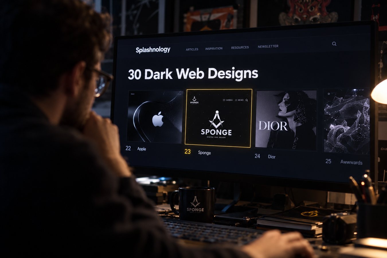
The roundup brought together thirty websites. It opened with Apple's site, which seems fitting for a publication about dark design. Dior was among the others, and studio Sponge stood at number twenty-three. The list is arranged like a catalog: major global brands, fashion houses, and small studios appear side by side, and each work is selected for how strongly it stands out visually.
The Site That Made the List
The Sponge work featured in the roundup was the 2013 version of the bureau's website. The main visual element was the brand's signature symbol: the square and compass, which in discussions of dark design are often associated with Masonic symbolism. The dark background, strict geometry, and a mark that is hard to mistake for anyone else's made the page easily recognizable. There was no text about the studio in the piece—only the name and an image—so the site spoke for itself.
By the time of publication, the work already had a professional accolade. On December 5, 2013, the site received an Honorable Mention on Awwwards, an international website competition. There, works of the day are selected daily, and honorable mentions go to projects that deserve attention but did not make the top. For student and small teams, such a mark means the site has passed expert review beyond the local market.
Almost simultaneously, the bureau was developing its online showcase. On August 23, 2013, the Sponge profile was created on Behance, a portfolio platform owned by Adobe. Here the studio publishes its work, designers and art directors from various countries see it, and platform curators highlight individual projects. The Splashnology roundup, which came out just over six months after the profile launch, became a notable continuation of this momentum.
What Was Happening Around
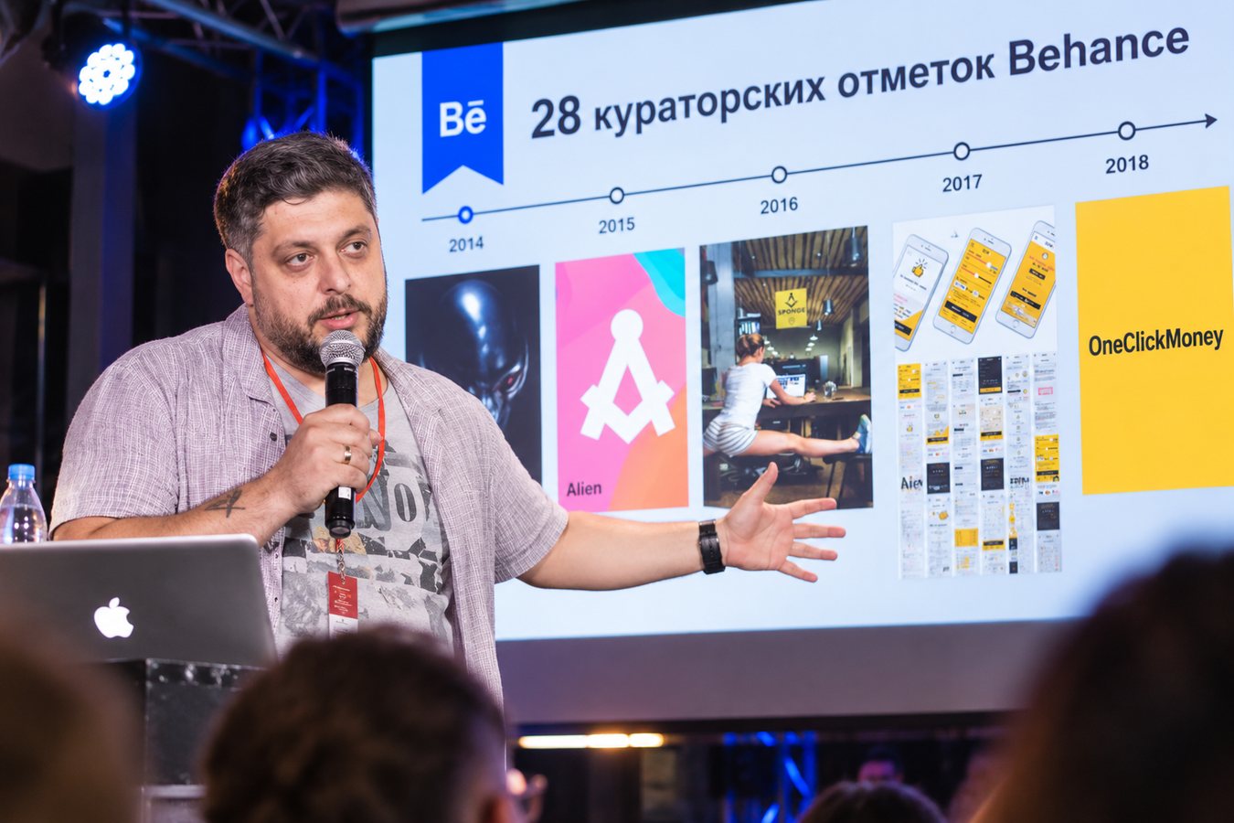
During these years, studio founder Bohdan Hnatiuk was building the bureau as a team that works for clients while also building its own reputation. Publications like the Splashnology roundup matter precisely because the site is seen by people who did not commission it and do not know the studio personally. For a design bureau, such mentions serve as external validation of quality, and that validation does not need to be bought.
The dark style, however, was not Sponge's only direction. The studio showed various works, and the dark 2013 version became one of the most recognizable. That is why it was chosen for a roundup about the dark web, even though the genre of such publications implies a rapid turnover of trends: today a page is in the spotlight, a year later another solution takes its place.
The Next Step
In the spring of 2014, the studio continued to enter professional arenas. On May 30, the 15th KMRF took place, to which Sponge submitted seven entries. The festival brought the studio no awards that year.
1