Ukrainian Design is a Ukrainian design competition in which the jury awards several tiers of prizes. Best of ranks below the highest tier, The Very Best of, but for a studio that enters the competition year after year, it is already recognition of professional work. 'Detector Media', covering the results, called the winners finalists, though it is more accurate to speak of Best of, since at the competition this is a separate tier.
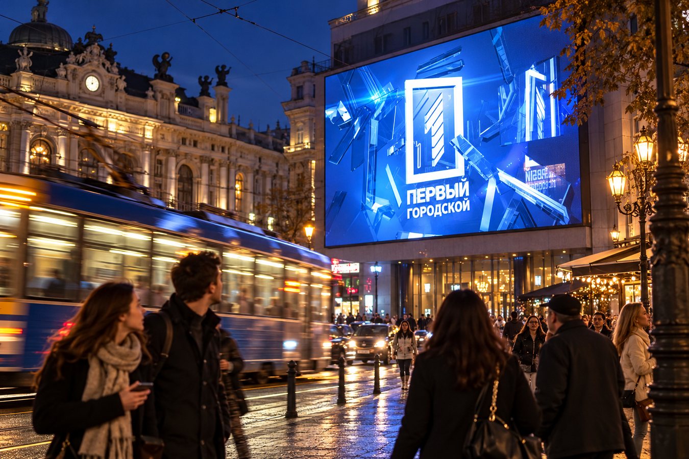
The new TV channel appeared in Odesa at the end of 2013 and needed a mark that would work equally well on screen and in print. Sponge approached the task as a test of systematic thinking. In its competition entry, the bureau formulated the requirements for the logo as follows: the mark had to be 'ambitious, geometrically correct, convenient and scalable'.
ambitious, geometrically correct, convenient and scalable
The final solution was built on a simple device. Next to the channel's name stands a number one in a rectangle. The figure reads instantly, requires no explanation and does not lose contrast when reduced to the size of an on-screen graphic. For television this is fundamental: the channel's mark is constantly present in the frame, often in a corner, over the picture, and must remain recognisable at any brightness and size. In printed materials the same mark works as a standalone brand without additional treatment.
Place in the competition
Sponge's work ended up in a category where competition is always fierce, since TV channels commission logos regularly and the requirements for them are strict. That same year, 'Detector Media' published a piece on the competition winners, placing the 'First City' logo alongside work for ICTV, STB and '1+1'. For an Odesa channel less than a year old, such company was notable. The publication explicitly stated that the logo was developed by 'creative bureau Sponge', meaning authorship was cemented in the industry press.
Ukrainian Design awards were not a one-off for the bureau. In 2013 Sponge had already received Best of at this competition for the website of the 'Chkalov' school, and in October 2014 the same level of award went to the Estetico.me website. Thus the TV channel logo became part of a series of works that the jury recognised over several seasons.
The studio in 2014
Work on the logo coincided with a period when the bureau was growing noticeably in the professional community. In December 2013 Awwwards gave the previous version of Sponge's website an Honorable Mention, and in March 2014 the studio was included in the Nice One I Like selection. In the second half of the year the bureau gave an interview in which executive director Kyrylo Solyar spoke about the company's work. Sponge's founder remains Bohdan Hnatyuk, who has led the studio since its creation.
Ratings in industry rankings also favoured the bureau. The interim Creativity Ukraine ranking, published on 17 October 2014, placed Sponge 12th with four points. By the end of the 2014/2015 season, the VRK ranking had the studio at 21st with the same four points. The ranking took into account agencies' work in various categories, so the TV channel logo contributed its share to the overall result.
What happened next
The 'First City' mark existed in its original form for several years. In 2017 the channel rebranded, and the new logo became a diamond with a number one inside. As 'Cyclopedia' writes, it was this version that became the basis of the channel's visual identity in subsequent years, while the former figure in a rectangle left the air.
1